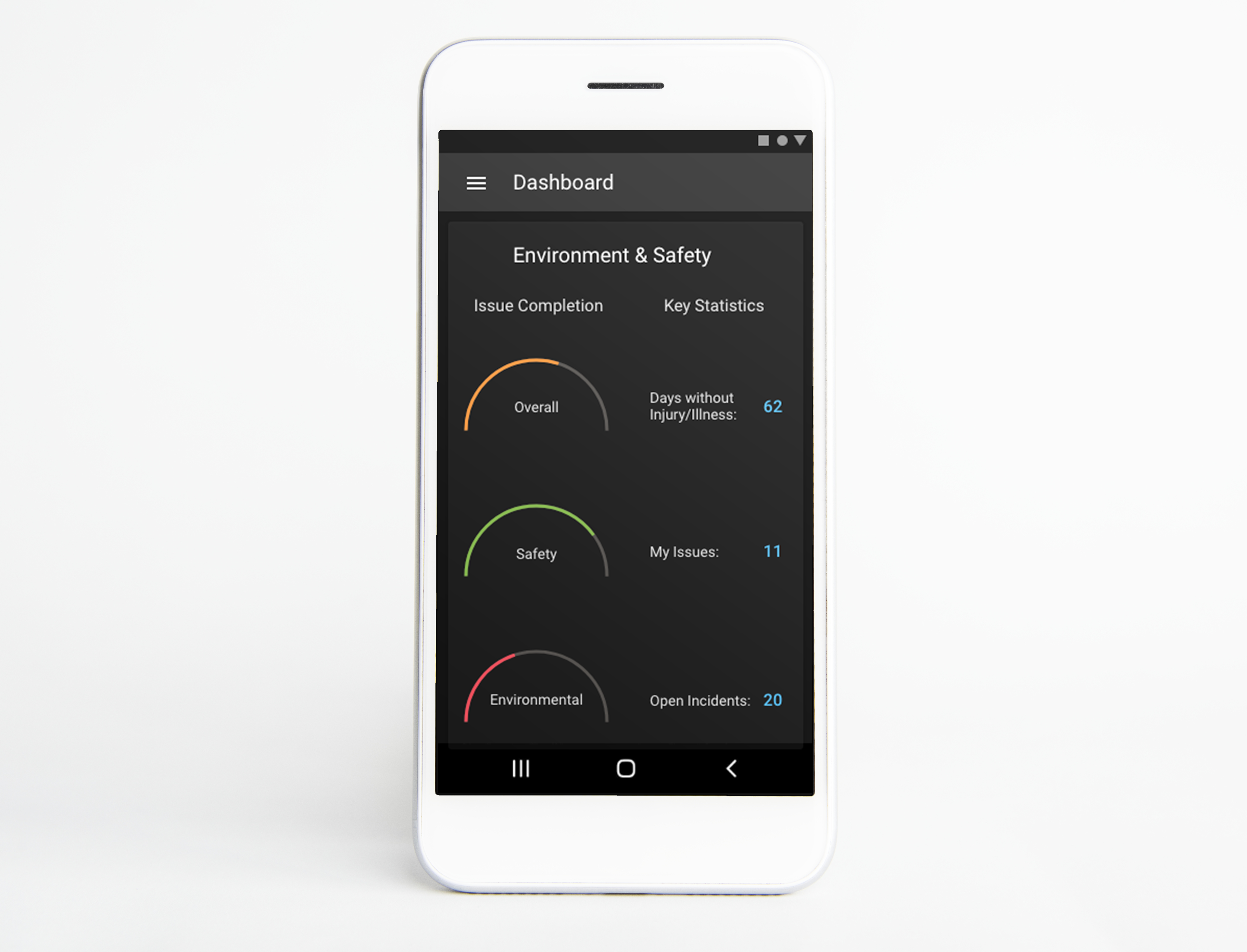
For this project, I was tasked with designing a dark mode for KPA's Vera Suite mobile app. Prior to this project, the app was built only for light mode, and users who enabled dark mode had a poor user experience - mostly due to contrast issues.
To ensure usability, I designed a theme that was in accordance with the Material Design guidelines, including ensuring that text met WCAG's accessibility standards, and selecting a color palette that would reduce eyestrain.
In addition to mockups, some of which are shown below, I also created a dark theme style guide that included typography and elevation guidance, color palette, and interactive UI elements.